Emergency Accessibility
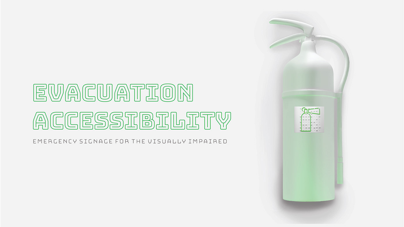
Emergency signage aims at alerting first-time visitors to a building as much as regular users. The Disability Discrimination Act of 1995 states that anyone with a disability has to be able to navigate and exit a building safely. Most buildings’ emergency plans for the visually impaired involve them finding a contact person who is sighted and can lead them to safety. However, in some situations, this contact may not be readily available. Emergency Accessibility Signage provides an equal playing field by planning for visually impaired users. The signage uses stark color contrast, glow-in-the-dark lighting, braille text, and tactile pictograms to better cater to low-light situations and visually impaired users.
This technique is useful in a number of situations for sighted people as well, such as: volcanic eruptions, wildfires, and building fires (where ash, smoke, and gas block light) or power outages caused by floods, storms, earthquakes, or tsunamis.
For those who can read braille, the raised braille text can be deciphered. For those who cannot read braille, the pictogram is colored with green glow-in-the-dark paint. If there is no light to see this glowing symbol, the user can also feel the pictogram tactically.


Graffiti evolution
Artists influence each other, incorporating similar elements into their work. This concept is true over all art forms including graffiti, where artists create personal ‘tags’ to differentiate themselves from others. Yet, common features of this art can still be identified. The tags are really a form of expressive typography, where the weight and curve of strokes vary. After studying different tags from the streets of Prague, the styles of graffiti can be organized into a variable typeface that evolves based on the user's needs. There is not a specific number of outcomes, but a range with infinite possibilities - so each user may create their own unique tag style.


Ethereal Stencil Typeface
This typeface was crafted through careful analysis of how spraypaint naturally behaves. The material has an innate movement, as it is actively sprayed through the air to achieve its final state. This spraying action can be seen visually in the floating letters with a gradient trail following behind each one. This trail flows down to the left, mimicking the direction that a spray takes from a bottle held in one’s right hand. In order to visually achieve a character, two stencils are needed for each letter. One paints the 3-dimensional area of the “back” of the letter, while the other paints the front. With the natural transparency of the material, the two stencils can be seen together, forming a letter. When paired one after the other, the trails of these letters can also overlap, creating an otherworldly pattern. For this reason, the typeface is named “Ethereal” as it seems like heavenly beams of light with an overlapping dance.


